Setting up your file for Special Ink
This will help us (and our press) know what areas of the design should be printed with a special ink. The inks we currently have available for this are White, Fluorescent Orange, and Silver. If you have any questions, or would like our designers to help you with your file setup, please don’t hesitate to contact us. We recommend always requesting (and allowing time for) a hard proof, to ensure that your design prints out the way you envisioned.
A note about white ink:
Usually in 4-color printing, the white of the paper is used as the white of the printed image. White ink allows you to add another dimension to your project by printing on colored or metallic papers.
Indesign/Illustrator Setup
Creating the Spot Color Swatch
These instructions are based on using Adobe Illustrator or InDesign for file setup. There are additional instructions for Photoshop in the ‘Photoshop Setup’ tab.
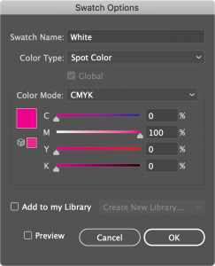
1. Create a spot color swatch for the ink. We recommend making this swatch a color that will stand out, such as bright pink (when it prints it will still be the correct color as long as the swatch is named correctly). To create the swatch, open the swatch window (Window/Swatches). Double click on an existing swatch or create a new swatch and double click it. Make sure the color type is set to spot color. The swatch names should be as follows:
White Ink: Make the swatch name “White” with a capital W
Fluorescent Orange Ink: Make the swatch name “FL Orange” with a capital F, L, and O
Silver Ink: Make the swatch name “Silver” with a capital S.
2. Apply the swatch to any text, fills, stroke, drop shadows, etc that you’d like to have the special ink.
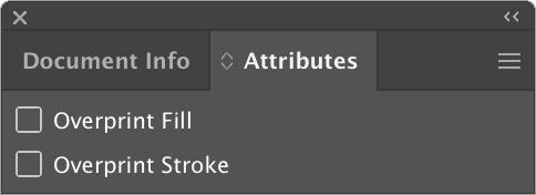
3. Turn overprint off. To find this setting go to Window/Attributes. This will make it so that the objects with the spot color print as fully opaque, without the images/colors from layers below showing through. Note that you can change overprint separately for fill and strokes. *If you are using white or silver ink as a base layer, ignore this step, and see the below section on “Setting Overprint for White/Silver as Base Layer”.
Setting Overprint for White/Silver as Base Layer
There are different ways to work with white/silver ink. The most obvious way is to have solid white or silver design elements printed onto colored paper. But you can also use white ink as a base layer, printed below other colors or below full color images to make them pop on colored paper. Silver as a base layer will add a metallic element to colors printed over it. Your overprint settings will help the press interpret how you’d like the design to translate into print. When you’re using the white/silver ink as a base layer, any objects above the white/silver ink layer should have overprint turned on, which will ensure that the white/silver ink is printed below the object.
Photoshop Setup
Creating Special Ink Channels in Photoshop
You can use channels in Photoshop to create a spot color for a raster image.
1. Select everything that you’d like to have the spot color and copy it to your clipboard.
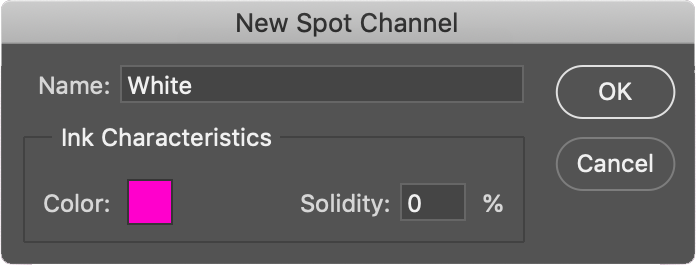
2. Go to Window/Channels and create a new spot color channel and name it “White”, “FL Orange”, or “Silver”, depending on which ink you’re using (spelling and capitalization are important here).
3. With the new channel selected, paste what you copied in step 1. To preview only what you just pasted, you can hide the other channels.
4. Invert the image in the channel (Image/Adjustments/Invert).
5. Save the file as a layered Photoshop PDF.